Rick Stein
I worked part-time within Rick Stein's in-house design team, contributing to the visual identity of one of the UK's best-known restaurant groups, across restaurants, rooms, retail and marketing in Cornwall, Sandbanks, Barnes and Winchester.
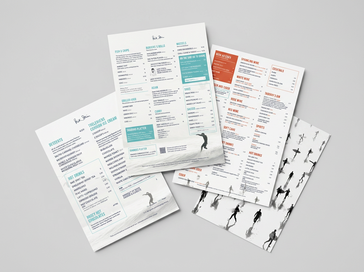
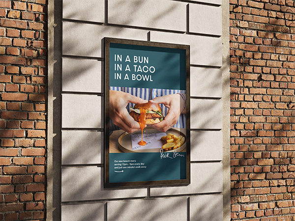
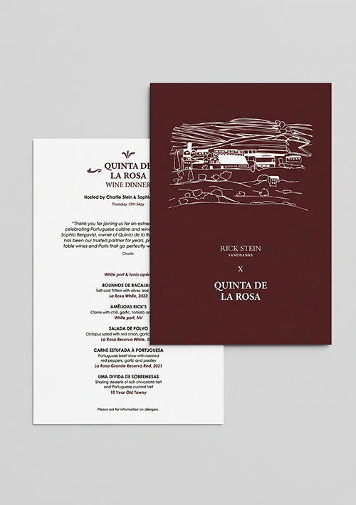
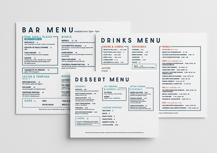
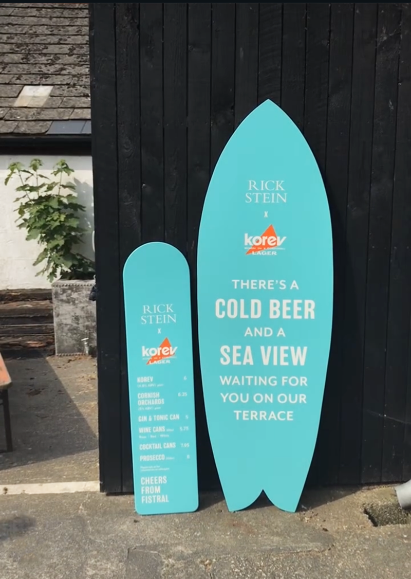
Each restaurant and site had its own distinct look and feel, so the work wasn't about rolling out one identity everywhere, it was designing within a family of different brands that all needed to feel unmistakably Rick Stein while staying true to their own personality. The Fistral menus used a teal and coral palette with playful illustrated silhouettes running to the water, while The Cornish Arms took a warmer, classic pub feel, cream tones and a handwritten script logo. In Sandbanks, where the menu mixed contemporary dishes with street food, the design was cleaner and more minimal, navy and white, crisp sans-serif type, built to suit a more casual, bar-led setting.
What I did
Menu design · Signage · Packaging · Illustration · Editorial design · Print production
Services
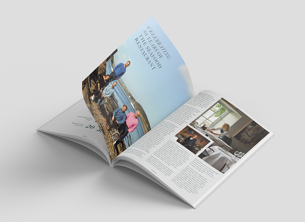
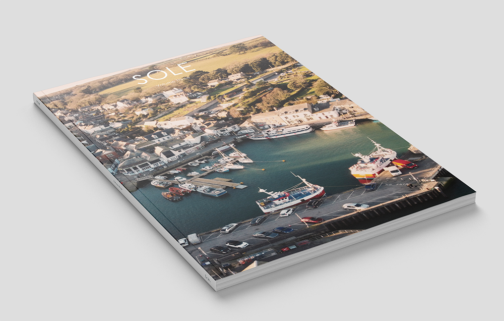
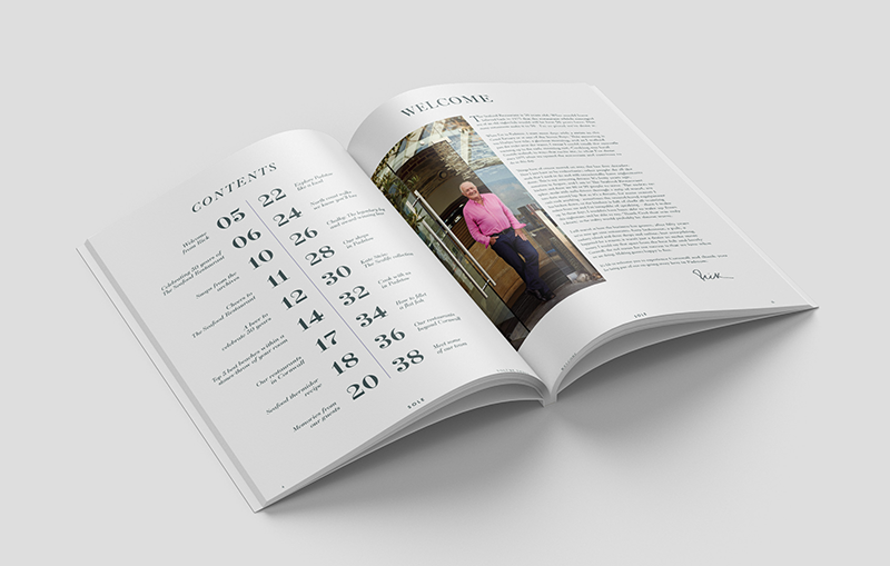
The main ongoing project was Sole Magazine, a 40-page publication for guests staying in Rick Stein's rooms. I designed and laid out the whole thing, covering food, travel and local stories, in a way that felt as coastal as the brand itself.
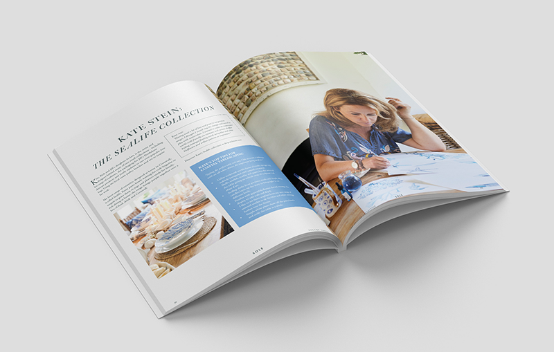
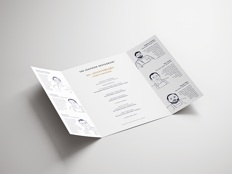
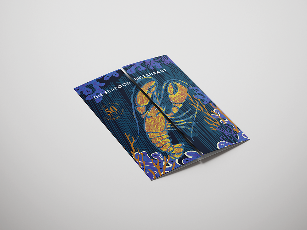
For The Seafood Restaurant's 50th anniversary, I designed a special menu around a cover illustration by Kate Stein, and illustrated the chefs myself for the inside pages, simple line portraits paired with each chef's own words, printed alongside the lobster cover and finished with gold foiling to mark the occasion.